Web Site Construction
Responsive Web Design presents an overview of the technologies implemented within the site, and the migration of single-page Web apps to iOS and macOS applications. This site is also an additional example of portfolio of works, see: Work Examples, DITA & S1000D and Professional Bio.
Framework
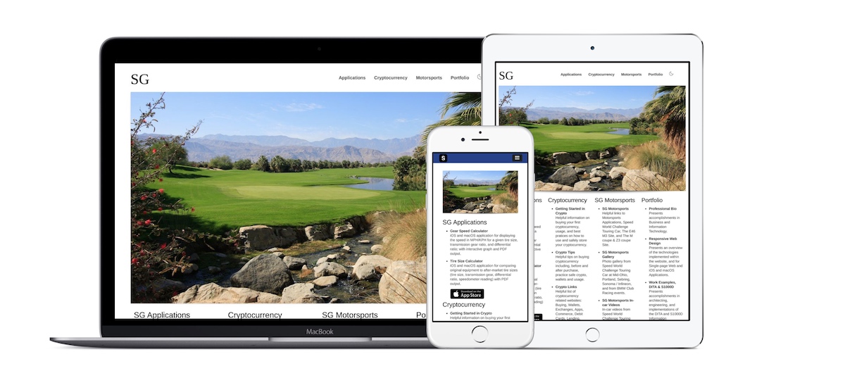
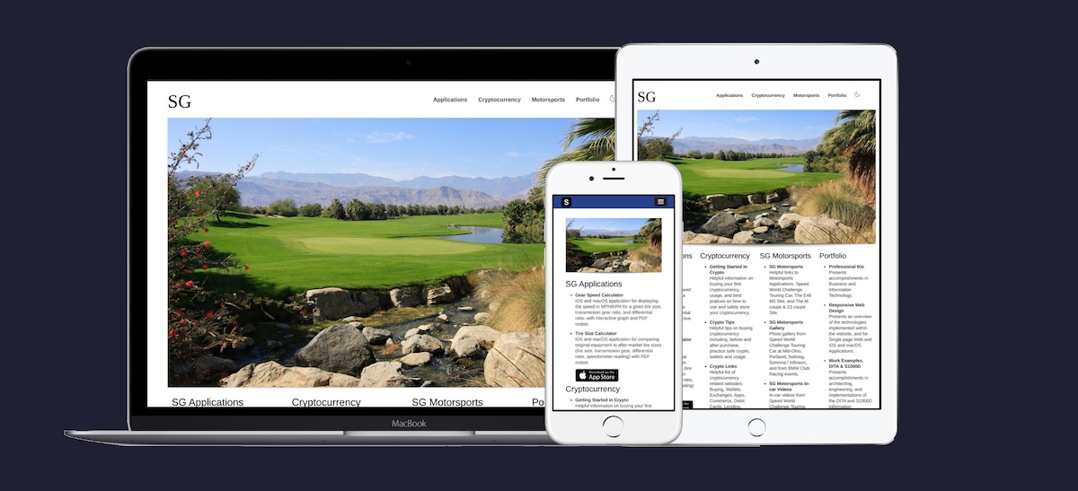
This web site uses responsive web design to deliver selected content and navigation, as shown above, based on the requesting device type, mobile to desktop, its orientation, and display capabilities. The site has been constructed using both a 12 and a 16 grid container systems and uses media queries to render, for both mobile and desktop, content for best user experience, including responsive graphics that are delivered based on the display size and resolution capabilities of the device. The site was build using both the Bootstrap and Skeleton framework CSS systems.
Coding and Libraries
The site has 'hand coded' HTML5, CSS3, JavaScrip, jQuery, and jQuery UI, and uses JavaScript libraries, plugins, and add-ins including Clipboard, Font Awesome, Flexslider, Lazyload, LightGallery, Modernizr, Prism, Slicknav, and Superfish for features and functionalities.
Structure Data
The pages on the site contain structure data (Open Graph, JSON-LD, Twitter Cards) to assist with Search Engine Optimization SEO and to support Rick Text experience.
HTML5 Semantic Markup
The pages on the site contain HTML5 semantic markup and coding has been validated using W3C Markup Validation Service, and Lighthouse for SEO Optimization and Mobile Friendly display.
Dark and Light Modes
This site supports both dark and light CSS theme display modes, which is auto-detected on page load based on the
user's system setting for their environment; [prefers-color-scheme: 'dark' or 'light'] and
[@media (prefers-color-scheme: dark | light)]. The display mode can be manually toggled by selecting
the Display Mode - Dark/Light icon
found in the upper right of the web page; both auto-detected and manual mode
store their settings locally and are read during page load to provide a consistent user-selected experience.
Search
Web site search function is implemented via a text form field which submits a site specific search quere using selectable indexing services of either DuckDuckGo, or Google.
Single-page Web Application
In the past, this site had two JavaScript Motorsports Web applications, which supported offline mode by setting up AppCache (offline application caching) through the use of a manifest file, which allows one to setup a local copy of the application on a mobile device for when there is no Internet connection.
iOS and macOS Applications
Both of the single-page Motorsports Web applications have been combined into a single-page web-to-mobile application with hardware-accelerated off-canvas design and navigation, and then converted into iOS and macOS applications Gear Speed Calculator, Tire Size Calculator, App on the App Store using Cordova and Xcode.
Supported Web Browsers
The SG | www.sgappdev.com web site is built around HTML5, CSS3, and Responsive Frameworks.
For best viewing experience, please upgrade or access this site with one of the following web browsers:
 Brave,
 Mozilla FireFox,
 Apple Safari,
 Google Chrome,
 Microsoft Edge,
 Opera
Opera

